Code Snack — Coin Flip Component
Building a CSS-first 3D Portrait Component with backface-visibility and transitions
Interactive UI doesn’t have to mean bloated animations or heavy JavaScript. CSS has a ton of functionality that can make some really cool effects without immediately reaching for framer-motion or other animation libraries. Let’s take a look at a coin-flip component that flips an image to reveal an alternate view on hover or tap. (In use on this site, but could also be used for a coin flip game, etc.) Along the way, we’ll dig into some lesser-used but powerful CSS properties that make this flip effect not only smooth, but also accessible and performant.
Code Sandbox Demo
Features:
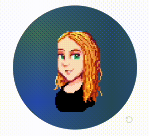
- Displays a circular pixel art image by default.
- On hover (desktop) or tap (mobile), flips to reveal a full photo portrait.
- Uses subtle shadowing, a flip hint icon, and accessibility-friendly motion fallbacks.
CSS Highlights
This component leverages some less-frequently-used CSS properties to create an animated 3D flip:
backface-visibility: hidden
This is the secret sauce of the flip illusion. When rotating elements in 3D space, both the front and back sides can be visible—unless you hide the side that’s facing away from the viewer. Read more on MDN
.portraitFlipFront,
.portraitFlipBack {
  backface-visibility: hidden;
}
Without this, you'd see a mirrored back bleeding through the front as the rotation nears 90°.
transform-style: preserve-3d
To make the flip feel dimensional, we tell the browser to maintain the 3D stacking of child elements. This way, the front and back faces stay in their 3D orientation while the container rotates.
.portraitFlipInner {
  transform-style: preserve-3d;
}
Otherwise, the child elements would flatten into 2D as the parent rotates, breaking the illusion.
.portraitImage.pixelArt {
  image-rendering: pixelated;
}
Depending on the browser, you might need fallbacks like -moz-crisp-edges or crisp-edges.
pointer-events: none on the flip hint The flip hint icon is purely visual. By disabling pointer events, we prevent it from interfering with hover detection on the container.
.portrait-flip-hint {
  pointer-events: none;
}
@media (prefers-reduced-motion: reduce)
Don't forget a11y! When the user has motion reduced, we swap the flip animation for a fade-in/out.
@media (prefers-reduced-motion: reduce) {
  .portrait-flip-inner {
    transform-style: flat;
    transition: none;
    transform: none;
  }
}
React
The component uses a simple useState toggle to track whether the portrait is flipped. Mouse events control the flip on desktop, while onTouchStart enables toggling on tap for mobile users.
const [isFlipped, setIsFlipped] = useState(false);

<div
  onMouseEnter={() => setIsFlipped(true)}
  onMouseLeave={() => setIsFlipped(false)}
  onTouchStart={() => setIsFlipped(!isFlipped)}
>
Not much else to say there, just a simple state toggle.
Styling Touches
Circular images: Achieved with border-radius: 100%. Could easily adjust to make a card.
Subtle drop shadows: Add depth without being distracting.
Responsive hint hiding: Hides the hover hint on mobile where hover doesn't exist.
.portrait-flip-container:hover {
  filter: drop-shadow(0 6px 12px rgba(0, 0, 0, 0.15));
}

@media (max-width: 768px) {
  .portrait-flip-hint {
    display: none;
  }
}
CSS has some underappreciated power. With just backface-visibility, transform-style, and a few thoughtful transitions, we created an interactive 3D component with minimal JavaScript. It's fast, responsive, and friendly to users who prefer reduced motion.